
Colour decisions become difficult when they are made one swatch at a time. A wall colour may look balanced in isolation and turn unexpectedly cool beside the flooring. A sofa chosen under showroom lighting may appear warmer at home. The solution is not to search for a universally ideal palette, but to build relationships among the fixed finishes, natural light and furniture.
The most dependable colour combinations have a clear hierarchy. One family provides the background, another gives the room depth, and smaller accents direct attention. This allows a home to feel considered without forcing every room into the same shade.
Read the Colours That Cannot Easily Change
Begin with flooring, stone, built-in cabinetry, window frames and other permanent surfaces. Identify whether their undertones lean warm, cool or relatively neutral. A grey floor may contain blue, green or brown; beige stone may have pink, yellow or olive notes. These quiet differences affect everything placed nearby.
Hold samples vertically as well as horizontally because light reaches walls, upholstery and tabletops differently. View them in the morning, afternoon and evening. Artificial lighting also changes colour, so inspect the combination under the fixtures that will be used after sunset.
Photographs are useful records, but they should not replace an in-room comparison. Camera settings and screens alter saturation and temperature. Keep physical samples together until the major furniture and wall decisions are confirmed.
Warm White, Walnut and Deep Green
Warm white creates a calm background without the sharpness of a blue-white wall. Walnut adds depth through its grain, while deep green introduces colour that remains connected to natural materials. This combination suits living rooms, studies and dining areas where the furniture should feel grounded.
Use green selectively. An armchair, rug detail or artwork may be enough. If the room has limited daylight, choose a green with some warmth rather than a near-black forest tone. Bronze or aged brass can bridge the walnut and green, while black may provide a finer graphic accent.
This is one of the more flexible home colour combinations because it can move from restrained to expressive depending on the green’s proportion. The background remains stable even if smaller accents change later.
Soft Grey, Oak and Rust
Grey becomes inviting when it is paired with visible timber and a warm, earthy accent. Pale oak prevents the scheme from feeling heavy, while rust, terracotta or burnt orange brings energy. This works well for a modern living area or informal dining room.
Choose the grey only after comparing it with the floor. A cool grey beside honey-toned timber may look disconnected; a greige or mineral grey can create a smoother transition. Rust is strongest in textured materials such as woven upholstery, a rug or ceramic object, where light produces natural variation.
Keep metals quiet. Blackened metal can sharpen the scheme, though too much may make the room feel industrial. A brushed nickel or muted bronze finish often sits more comfortably with oak.
Cream, Travertine and Tobacco
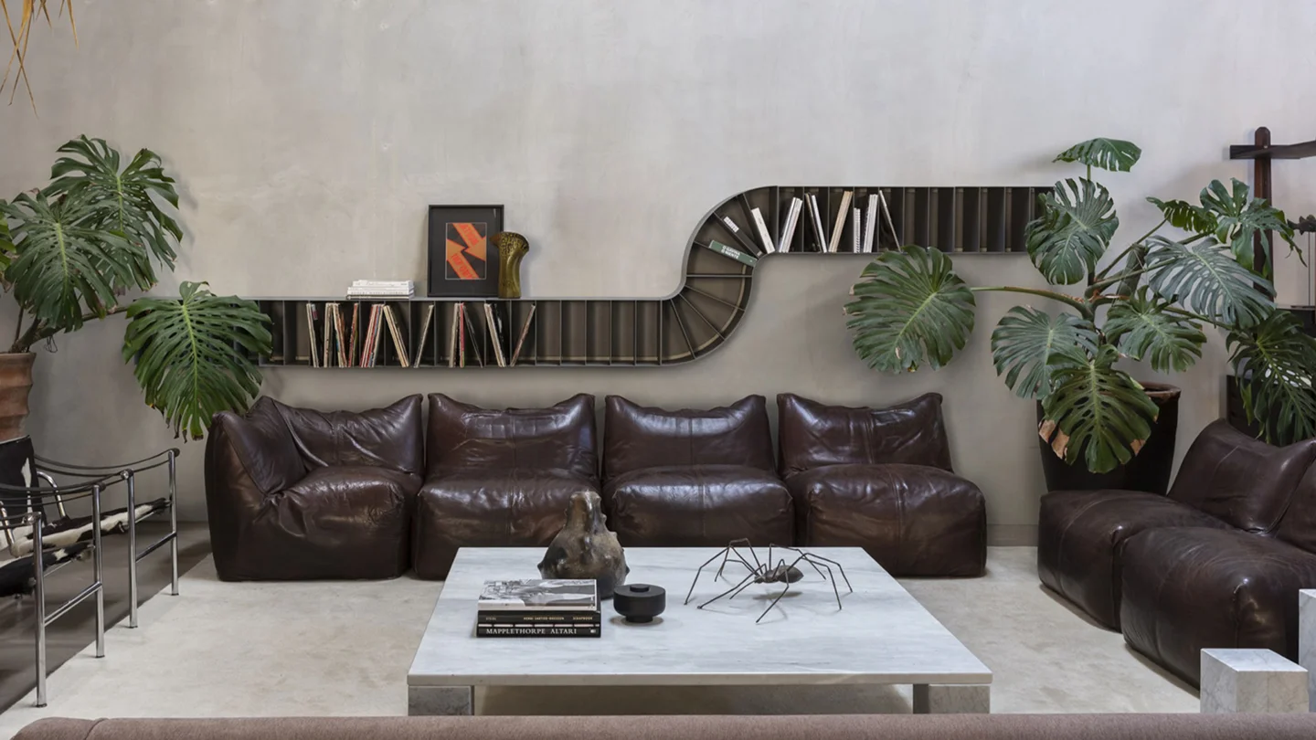
Cream upholstery, pale stone and tobacco leather create a tonal room with enough contrast to remain legible. The palette is especially effective where sunlight can reveal the texture of stone, leather and fabric.
The key is variation. If every surface is the same smooth beige, the room can feel flat. Combine a nubby textile, honed stone, visible leather grain and perhaps a dark timber edge. The materials carry the contrast even when the colours stay close.
The Oscar coat hanger pairs fine wood with a natural travertine base, illustrating how two warm natural materials can remain distinct through geometry and surface. The same principle can guide a larger room.
Navy, Camel and Off-White
Navy brings structure, camel adds warmth and off-white keeps the composition open. This palette can support a formal living room, library or bedroom without relying on black for contrast.
Decide where the darkest colour will sit. A navy sofa becomes the visual anchor; a navy wall creates an architectural field; navy cushions simply add punctuation. Avoid distributing it in equal amounts across many small objects, which can make the room feel themed.
Camel leather or warm woven upholstery softens the navy. Add timber with a medium or dark tone and keep the off-white slightly warm so it relates to both. A small amount of brushed metal can add definition without taking over.
Sage, Sand and Charcoal
Sage and sand form a gentle base, while charcoal gives edges and silhouettes more clarity. This combination works in bedrooms, calm living areas and homes with garden views. It also adapts well to matte finishes.
Use charcoal on frames, legs, lighting or one compact furniture form rather than automatically choosing a dark wall. The contrast should help the eye understand the composition. Sage can sit on a wall or an upholstered piece, but compare it with outdoor greenery because reflected light may intensify its green quality.
Among practical home colour combination ideas, this one is useful for connecting indoor and outdoor views without copying nature too literally. Stone, ceramic and woven textiles reinforce the palette through material.
Burgundy, Blush and Smoked Glass
For a richer room, burgundy can be balanced by a muted blush or dusty rose and the cool depth of smoked glass. The result depends on restraint. Burgundy works best as a substantial accent, such as an armchair or rug field, rather than a collection of small red objects.
Smoked glass and dark metal prevent the scheme from becoming overly soft. Keep the background neutral and avoid adding several competing jewel tones. A single artwork may introduce neighbouring colours while holding the palette together.
The Geo mirror combines smoked glass with a brushed bronze frame. It offers a useful reference for how tinted reflective material can add depth without behaving like a solid dark surface.
Black, White and One Natural Material
Black and white can feel timeless, but only when texture and proportion keep them from becoming harsh. Introduce oak, walnut, cane, leather or stone as a natural third element. It moderates contrast and makes the room more comfortable to inhabit.
Use black where it can describe an edge: a table base, fine frame, lamp or architectural opening. Large black surfaces need sufficient light and breathing room. White upholstery should be selected with maintenance in mind, and an off-white may relate better to warm flooring than a pure optical white.
This family of interior colour combinations responds well to sculptural furniture because the contrast makes outlines clear. It also exposes poor scale quickly, so edit accessories and allow empty wall area around significant pieces.
Build a Palette Across Connected Rooms
An open-plan home should feel related, but it does not need one repeated formula. Choose a base neutral that travels through the connected areas, then let each zone emphasise a different supporting colour. The living room might use green, the dining area walnut and bronze, and the entrance a darker version of the same neutral.
Sightlines matter. Stand at the entrance and note every room or surface visible at once. Two accent colours that work separately may compete when seen together. Doorways can frame a stronger colour in a distant room, turning it into a deliberate focal point.
A controlled colour palette for home can include several colours if their undertones and roles are clear. The palette becomes confusing when too many shades perform the same job.
Let Furniture Carry Colour Deliberately
Walls are not the only place for colour. A sofa occupies a large visual field, while a dining table can introduce timber, stone or ceramic across the centre of a room. Rugs connect several furniture pieces and can distribute colour more softly than painted joinery.
The Lago furniture collection is known for clean lines, modular ideas and a playful use of colour and materials. Looking at colour as part of the furniture’s architecture, rather than as decoration applied afterward, can lead to more coherent decisions.
For a statement piece, compare its finish with every direction from which it will be seen. A vivid sideboard in an entrance may also be visible from the living and dining areas. Give it enough neutral space, and avoid echoing its colour through multiple unrelated objects.
Test Proportion Before Committing
A small sample cannot show how a strong colour will behave across an entire wall or sofa. Paint a large movable board and view it around the room. For upholstery, place the largest available sample vertically and beside the floor, curtains and adjacent furniture.
Use a simple distribution rather than a rigid formula. The background colour should generally occupy the largest area, the supporting material or colour a substantial secondary area, and the accent the least. Adjust this according to architecture and light. A dark, bright room can carry more saturation than a narrow room with limited daylight.
These practical home colour ideas also need to account for maintenance. Very pale upholstery, glossy dark surfaces and high-contrast rugs show different kinds of everyday wear. A palette that suits the household will age more gracefully than one chosen only from an image.
Edit for Longevity
Timeless does not mean colourless. It means the main decisions can accommodate change. Keep expensive, difficult-to-replace pieces in colours you genuinely enjoy over time, then use cushions, art and smaller objects for more experimental notes.
Avoid buying every item from one colour story in a single day. Once the main furniture is placed, the room may need less accent than expected. Natural light, artwork and books add colour too. Leave room for them.
Ventura brings together furniture, lighting, rugs, mirrors and accessories from European design brands. Explore the Ventura product selection or compare finishes at the Bengaluru and Hyderabad showrooms. Material samples viewed together can reveal undertone conflicts early and turn a promising palette into a room that feels settled.
The best colour combinations do not call attention to a rule. They make the furniture, architecture and daily life easier to read as one composition.
0 Comments