
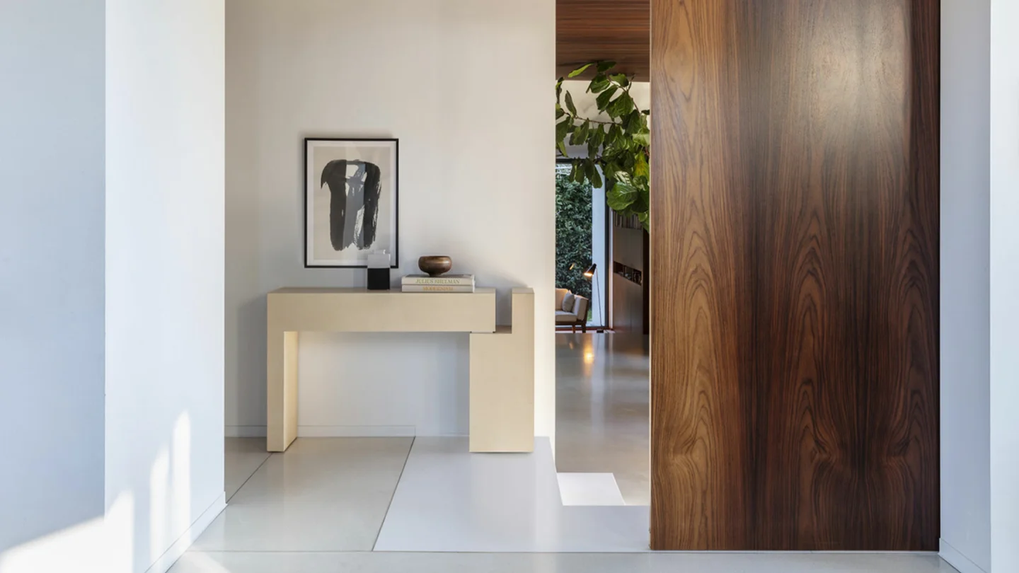
A room can contain expensive furniture and still feel unsettled. The problem is often not the individual pieces, but the lack of a clear relationship between them. Too many focal points compete, materials change without a reason, or furniture sits at a scale that does not suit the architecture.
Useful home design ideas begin with hierarchy. One element leads the room, supporting pieces create rhythm, and enough empty space allows the composition to register.
Give Each Room a Visual Anchor
The eye needs somewhere to settle. In a living room, the anchor may be a sofa composition, an integrated wall system, a large artwork or the view beyond a window. Choosing one does not make everything else secondary in quality. It simply gives the room an order.
Place the anchor in relation to the main approach. A sofa seen from the entrance may need a finished back and clear space around it. A feature wall should align with the seating rather than occupy the largest wall by default.
Once the anchor is established, reduce competition nearby. Several strong shapes, colours and finishes placed within the same field of view can make each one feel less distinct.
Use Proportion Before Decoration
Scale affects a room’s appearance more quickly than accessories do. A small coffee table can make a broad sofa look heavier, while an oversized pendant may compress a dining area even when the ceiling is generous.
Compare furniture dimensions to the room and to one another. The width of a console should relate to the wall or artwork above it. Dining chairs need enough visual weight to sit confidently beside the table. Rugs should connect a furniture group rather than float between its pieces.
Mock up large items with tape or paper before ordering. This simple exercise reveals whether a composition has breathing room and whether circulation remains comfortable.
Repeat Materials Without Creating a Matching Set
Material continuity gives home design a recognisable thread. A wood tone may reappear in a dining table and wall panel, while brushed metal connects lighting, furniture bases and hardware.
Repetition should be selective. Using the same finish on every surface can flatten the room. Instead, carry one or two materials across zones and vary their scale or texture. A large timber plane may be balanced by a smaller detail in the same family.
Contrast is useful when it has a role. Glass can lighten a dense storage wall. A tactile rug can soften stone flooring. Dark metal may sharpen the edge of upholstered furniture without becoming another dominant feature.
Control Colour Through Visual Weight
Colour is not experienced as a swatch alone. The same shade feels stronger across a large sofa than it does on a cushion or small chair. Decide which surfaces will carry the greatest area before choosing accent colours.
A restrained base can support one deeper tone without making the room feel busy. The darker colour might appear on an armchair, a lacquered cabinet or an artwork, then return in a smaller detail elsewhere.
Natural light changes this balance across the day. Test paint, upholstery and timber samples beside one another in the actual room. A cool grey may become blue near a window, while a warm neutral can appear yellow under artificial light.
Avoid treating beige, grey or white as automatic solutions. Their undertones need to relate to the flooring, stone and wood already present. A neutral room still depends on contrast in texture, depth and sheen.
Let Storage Shape the Architecture
Visible clutter weakens interior aesthetics because it breaks the lines that hold a room together. Storage planning should begin with the items that need a place, then decide what should remain visible.
Full-height systems can turn an irregular wall into a continuous surface. Low sideboards preserve wall space for art, while suspended cabinets expose more floor and make a compact room feel lighter.
Open shelves need editing. A sequence of books, objects and empty areas reads more clearly than every compartment being filled. Closed storage can carry the everyday items that would otherwise interrupt the composition.
Ventura’s Wall System by Poliform combines a bookcase structure with shelves, doors, display cases and back panels. Hinged, sliding and drop-leaf fronts allow open and concealed functions to sit within one coordinated wall.
Work with Curves and Straight Lines
Modern home design ideas often combine rectilinear architecture with softer furniture. Curved seating can ease the transition through an open room and encourage a more conversational arrangement. Straight storage and tables provide the counterpoint that keeps the composition precise.
The balance depends on quantity. One curved sofa may be enough to change the room’s movement. Repeating arcs across every chair, table and lamp can turn a useful gesture into a theme.
Poliform’s Orbis Sofa uses curved lines and an enveloping backrest. The collection includes two sofas and an armchair, allowing the rounded language to be carried through the seating without requiring unrelated decorative forms.
Design the Empty Areas
Negative space is part of the floor plan. It frames furniture, clarifies movement and allows materials to be noticed. Filling an unused corner simply because it is empty can weaken the room.
Look at the gaps between the sofa, tables, chairs and walls. They should feel intentional and support movement. A generous passage beside a sculptural chair may contribute more to the room than an additional console.
Wall space matters too. Artwork does not need to occupy every blank surface. A quiet wall can balance a detailed storage system or a strong view.
Layer Lighting Around Activities
One bright ceiling source tends to flatten materials and produce harsh shadows. A useful lighting plan combines general light with focused illumination and lower ambient sources.
Place light where activities occur. Reading needs a controllable source near the seat. Dining benefits from light centred on the table. Integrated shelf lighting can reveal depth, but it should not make every compartment equally bright.
Colour temperature and dimming should be considered across adjoining rooms. Abrupt changes can break the visual continuity between spaces at night.
The Poliform Helga Lamp is available in floor and table versions. Its steel and plexiglass construction with a linen-covered light source offers a way to repeat one lighting language at different heights.
Resolve the Edges and Junctions
Small junctions often decide whether a room feels considered. Check where a rug ends in relation to the sofa, how a curtain meets a built-in unit and whether a console aligns with the wall panel behind it.
Furniture should not appear almost centred or almost aligned unless the offset is clearly intentional. On elevations, compare the top lines of doors, shelves, artwork and lighting. A few disciplined alignments can organise a room containing varied objects.
Cables and outlets deserve the same attention. A lamp cord crossing an open floor or a media cable hanging below a cabinet can interrupt an otherwise calm composition. Their routes should be planned before furniture positions are fixed.
Build Continuity Between Rooms
Luxury home design ideas do not require every room to look identical. Continuity can come from a repeated proportion, a limited family of metals or a consistent approach to doors and storage.
Sightlines are useful guides. Stand in the hallway and note which rooms are visible together. Materials placed within the same view should relate, even when each room has its own colour and function.
Thresholds deserve attention. Flooring transitions, door frames and the ends of built-in systems often reveal whether the home was planned as a whole or furnished room by room.
Choose Furniture for the Household, Not the Photograph
Furniture for home use must support ordinary habits. A sculptural chair that is rarely comfortable enough to use becomes a large object occupying valuable space. A table with a sensitive surface may create unnecessary caution in a busy family room.
Visual quality lasts when practical decisions are resolved. Seat depth should suit the household. Storage should match the items it contains. Finishes should reflect maintenance expectations and natural light.
This is where premium design becomes quieter. The room does not need to advertise every decision because proportion, joinery and material relationships are already doing the work.
Review the Home as One Composition
Before finalising home interior ideas, compare floor plans, elevations, finish samples and key furniture dimensions together. A decision that works on one page may conflict with another when lighting, storage and circulation are added.
Ventura’s private-client process begins with needs and floor plans, followed by curated planning, specifications and project coordination. This creates a useful setting for reviewing furniture and built-in solutions as parts of the same interior.
The strongest home design ideas improve the overall composition by removing uncertainty. Each room has a clear anchor, materials repeat with restraint, and practical storage protects the arrangement from daily clutter.
To review furniture, finishes and spatial relationships for your home, arrange a consultation through Ventura Interiors in Bengaluru or Hyderabad.
0 Comments