
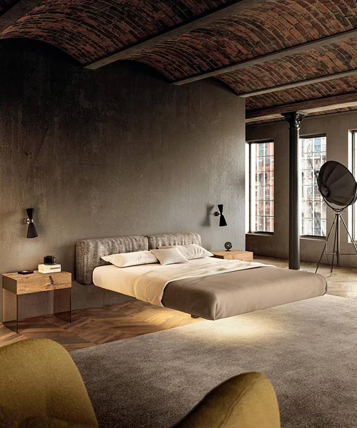
Time to Indulge in Elegance
Welcome to Ventura, home of the timeless
Luxe at your service
Personalised assistance from our team of experts
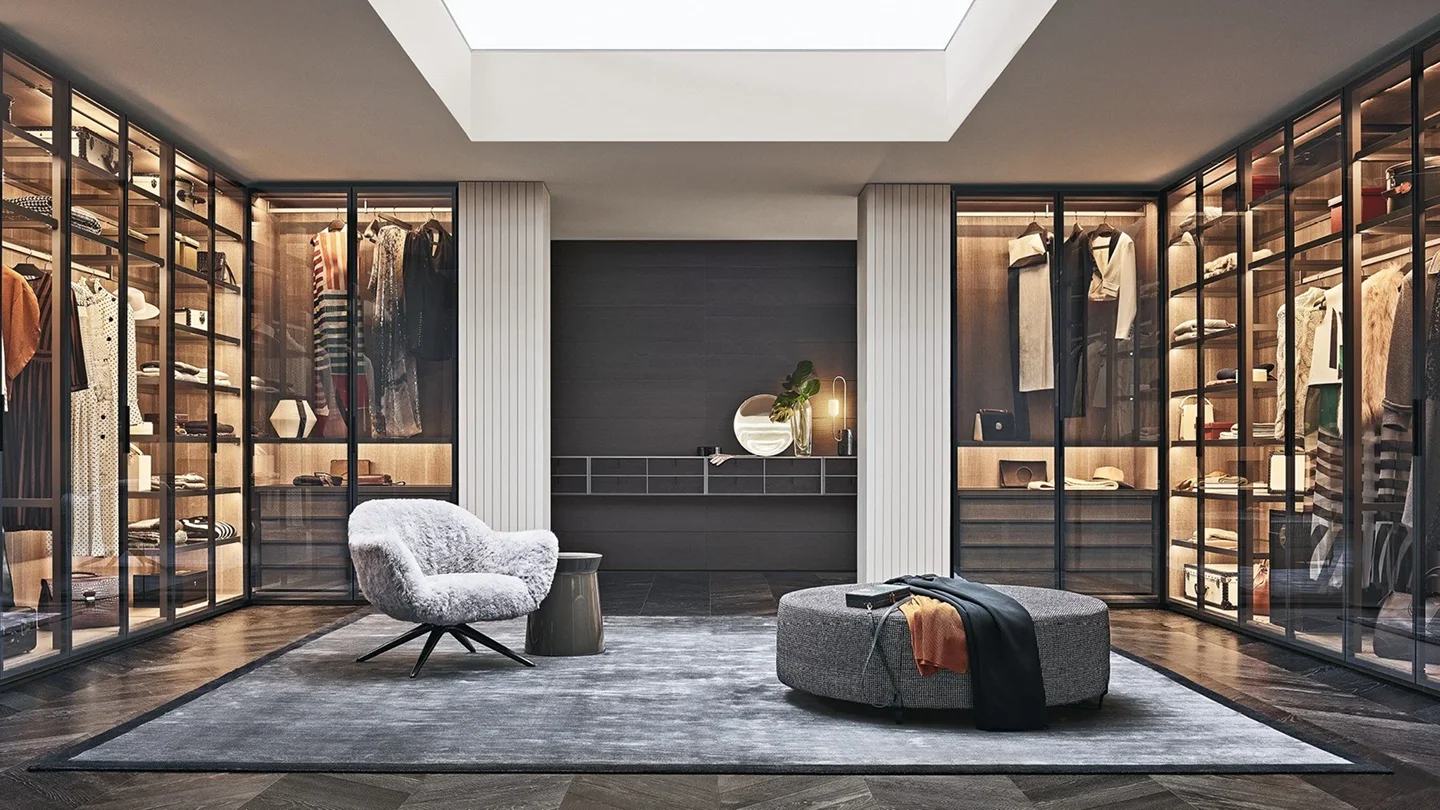
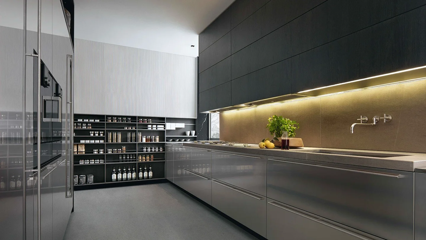
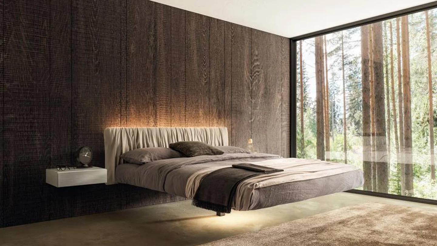
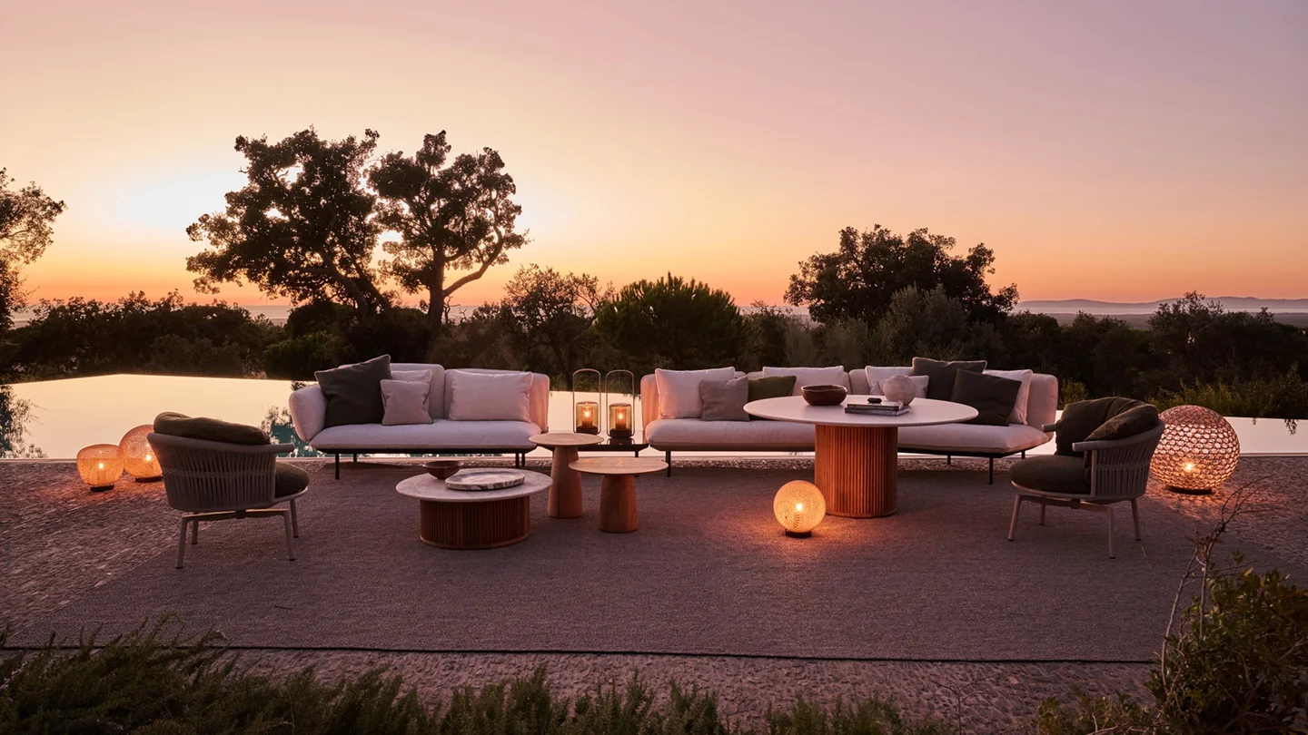
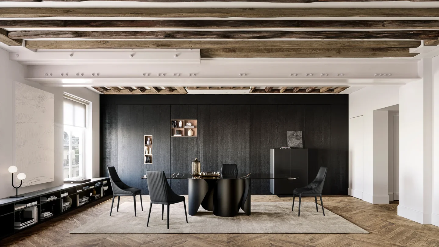
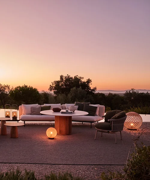
Reflect Opulence
Explore exquisite designs that exudes your personality
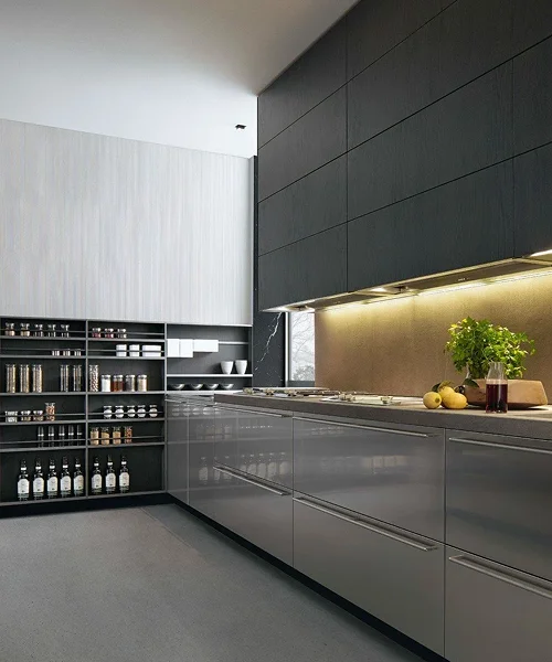
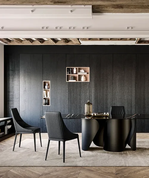
The world in your space
Ventura hosts global designer brands that suit your space, and your taste
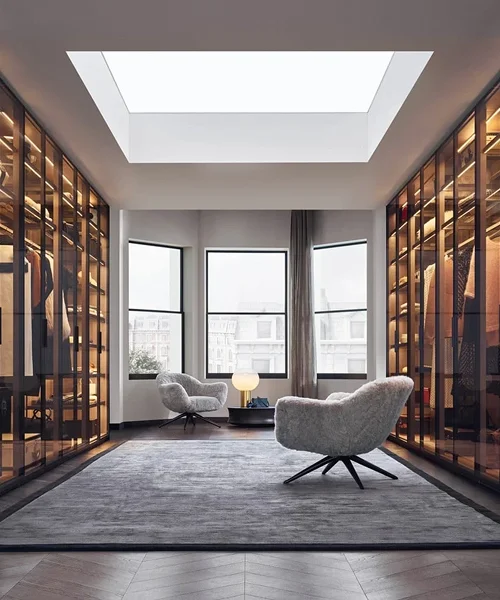
Find your muse
Visit our exquisite showrooms at Bengaluru & Hyderabad
Time to Indulge in Elegance
Welcome to Ventura, home of the timeless
Reflect Opulence
Explore exquisite designs that exudes your personality
Luxe at your service
Personalised assistance from our team of experts
The world in your space
Ventura hosts global designer brands that suit your space, and your taste
Find your muse
Visit our exquisite showrooms at Bengaluru & Hyderabad
About us
At Ventura Interiors, we bring to your doorstep the best luxury furniture with our exclusive portfolio of modern and designer furniture from renowned European brands, across India. We do not just furnish spaces, but curate experiences that exude luxury. Learn more about Casino utan svensk licens.
Rooted in sophistication and driven by design, Ventura is where craftsmanship meets cutting-edge style.We offer tailored solutions that integrate enduring beauty with effortless functionality.
services
For Private Individuals
At Ventura Interiors, we help homeowners bring their dream spaces to life with a curated selection of luxury furniture and modern furniture. Whether you’re furnishing a new home or updating your interiors, our collection includes timeless designer furniture from top European brands. With personalized design support and access to exclusive pieces, we make luxury furniture in India effortlessly accessible for discerning individuals.
services
We collaborate closely with architects and interior designers to integrate our luxury furniture collections into their creative vision. From sleek modern furniture to high-end, functional solutions, Ventura Interiors offers end-to-end support across sourcing, planning, and execution. With access to luxury modern furniture and global brands, we help design professionals deliver standout spaces with unmatched quality.
services
Ventura Interiors offers tailored solutions for the contract world — from boutique hotels to premium office spaces. Our versatile range of modern furniture and luxury furniture delivers durability, aesthetics, and efficiency. With deep experience in large-scale projects and access to the finest luxury furniture India has to offer, we support architects, developers, and procurement teams in creating refined, high-impact commercial environments.
Our Brands
V

Venture into the World of Ventura
Team
We are a dedicated team of seasoned, skilled, and enthusiastic professionals. Above all, we are individuals who deeply value empathy and its significance in every interaction.
Experience
Furniture and design are woven into the fabric of our existence. For over a decade, they have been integral parts of our daily lives.
Trust
Entrusting someone with the design of your home is akin to handing over the keys to your sanctuary. That’s why establishing trust is paramount to us.
Research & Strategy
Guided by curiosity and strategic vision, we extend our reach beyond the confines of the design world, forging seamless connections with the broader environment that envelops us.
Quality
At Ventura, we meticulously curate a collection of impeccably designed products crafted to the highest standards of quality and sustainability. Each item is thoughtfully selected, boasting materials engineered to endure the test of time.
Holistic Approach
Whether it’s a product or service, a ready-made item, or a personalised bespoke design, we invite you to step into a universe that caters to all your needs.
Brand Video
What kind of furniture does Ventura Interiors specialize in?
Do you offer furniture for both homes and commercial spaces?
Yes, we cater to private residences, hospitality projects, and corporate spaces with bespoke solutions tailored to each environment.
Is Ventura’s collection available across India?
Can Ventura help with full home furnishing and layout planning?
What makes Ventura Interiors different from other furniture stores?
Your In-Store
Experience Awaits
Deals You Can’t Get Online